User Interface Icons: A Modern Design Resource for Web and Mobile Projects
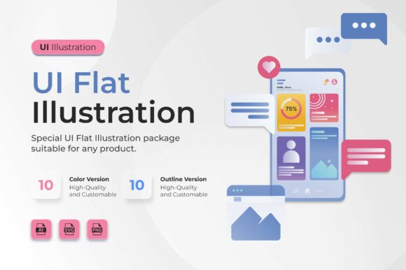
Designers working on digital interfaces often seek visual elements that blend functionality with aesthetic appeal. User Interface Icons offers a curated illustration pack tailored for mobile and web interface development. This collection includes both color and outline styles, making it adaptable for a variety of design needs. The pack’s flat UI approach emphasizes clarity and usability, helping designers maintain visual balance without sacrificing simplicity.
What Sets User Interface Icons Apart?
The User Interface Icons package stands out due to its deliberate focus on interface-specific components. Unlike generic icon sets, this pack includes design elements such as cards, chat bubbles, dashboards, and mobile screens—components commonly found in modern UI layouts. Each illustration is crafted with soft gradients and rounded edges, aligning with current design trends while maintaining a clean and professional look.
One of the key advantages of this resource is its format variety. The package includes 10 SVG files, 10 PNG files, and 1 editable AI file, allowing for both scalability and ease of customization. The transparent background feature further enhances flexibility, enabling seamless integration into different design environments. These files are available exclusively on Creative Fabrica, ensuring originality and quality.
Comparing Flat Illustration Styles
Flat illustration has become a dominant style in UI design due to its minimalistic and scalable nature. However, not all flat illustration packs are created equal. Many icon sets focus on broad themes such as business, education, or health, but may lack the specific UI components needed for digital interface design. User Interface Icons fills this niche by offering a focused collection built specifically for app and web developers.
Compared to more abstract or decorative illustration styles, flat UI illustrations like those in this pack provide a more structured and functional visual language. They are ideal for designers who need to communicate interface elements clearly without overwhelming users with visual complexity. In contrast, skeuomorphic or highly detailed illustrations may offer more realism but often come at the cost of performance and adaptability.
Strengths and Practical Use Cases
The primary strength of User Interface Icons lies in its purpose-driven design. Since the illustrations are crafted with UI components in mind, they are particularly well-suited for:
- Dashboard interfaces
- Mobile app screens
- Onboarding flows
- Web-based SaaS platforms
Designers can easily integrate these illustrations into Figma, Sketch, or Adobe XD workflows, using them as placeholders, visual guides, or final UI assets. The SVG format ensures crisp visuals at any scale, while the PNG versions offer quick access for prototyping or presentations. The AI file allows for deeper customization, especially when a project requires tailored color schemes or layout adjustments.
Tradeoffs and Limitations
While User Interface Icons offers a clean and functional design language, it may not be the best fit for every project. For instance, brands that rely on highly stylized or illustrative storytelling may find the flat UI style too restrictive. Additionally, the pack contains a limited number of illustrations—10 color and 10 outline—so larger projects requiring a broader visual library may need to supplement with additional resources.
Another consideration is the licensing and distribution model. All files must be downloaded directly from Creative Fabrica, and redistribution is not permitted. This helps maintain the integrity and exclusivity of the illustrations but may require teams to coordinate asset access carefully, especially in collaborative environments.
When to Choose User Interface Icons
User Interface Icons is a strong option for designers seeking a clean, modern, and interface-focused visual toolkit. It’s particularly well-suited for:
- Startups building web or mobile apps with tight deadlines
- Designers who need to maintain consistency across UI elements
- Projects requiring scalable vector graphics without loss of quality
- Teams that value exclusive, high-quality design assets
If your project demands a minimalist yet functional visual style and includes standard UI components like dashboards or mobile screens, this pack can streamline the design process and reduce the need for custom illustration work.
When to Consider Alternatives
Despite its strengths, there are scenarios where User Interface Icons may not be the ideal choice. For example:
- Projects requiring a broader range of thematic illustrations (e.g., travel, education, or finance)
- Designs that benefit from a more expressive or narrative-driven visual style
- Teams needing a larger library of icons or illustrations for enterprise-level applications
In such cases, designers may want to explore more expansive illustration libraries or mixed-style packs that combine flat design with other visual approaches. It’s also worth considering whether the project requires multi-format support beyond SVG and PNG, such as animated icons or 3D renderings.
Making an Informed Design Decision
Choosing the right illustration set involves balancing design needs, project scope, and team workflow. User Interface Icons provides a focused, high-quality solution for digital interface design. Its flat UI style promotes clarity and usability, and the inclusion of both color and outline variations adds flexibility. However, it’s important to assess whether the pack’s scope and format align with your project’s long-term needs.
For many web and mobile designers, this pack offers a practical and visually cohesive toolkit that supports efficient development and clean visual communication. By understanding its strengths and limitations, you can determine whether User Interface Icons fits your design goals or if another resource might better serve your needs.